Bottle Green
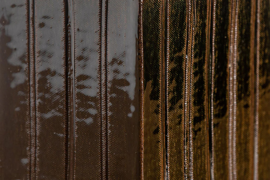
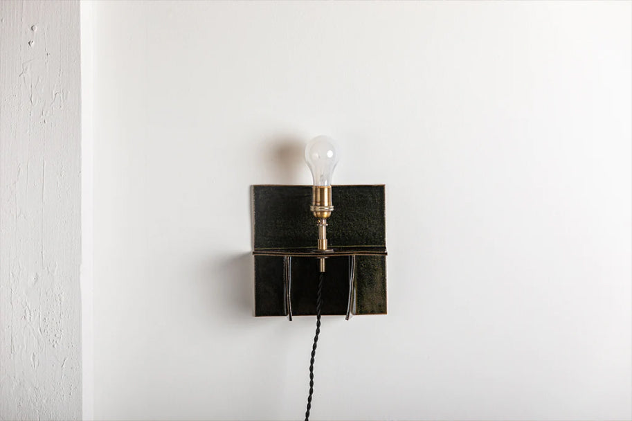
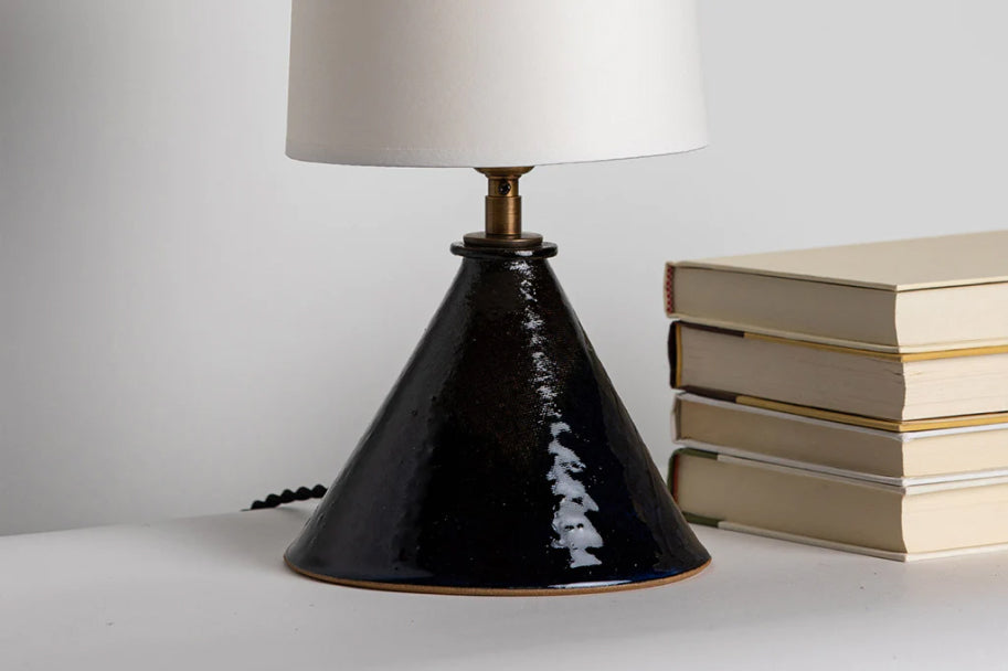
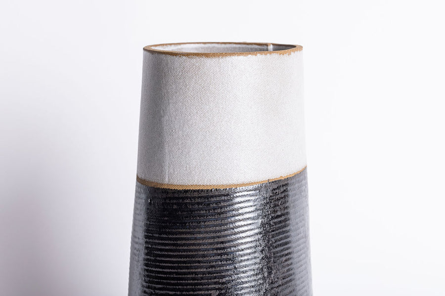
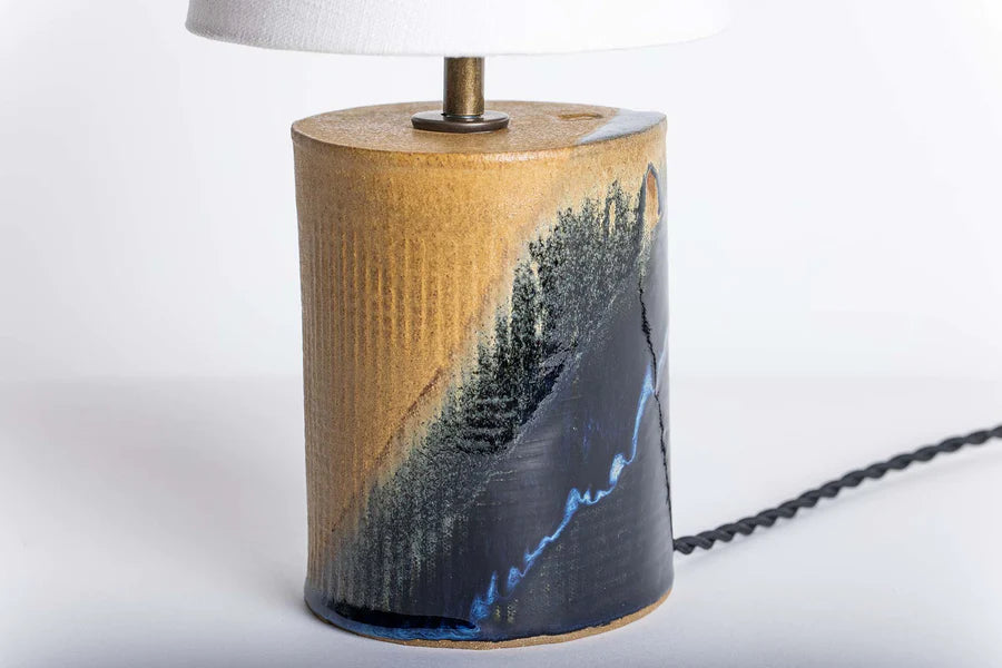
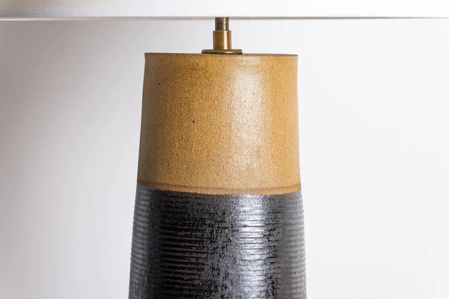
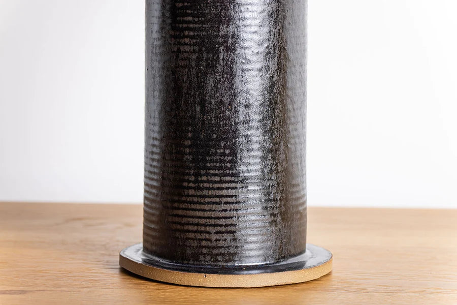
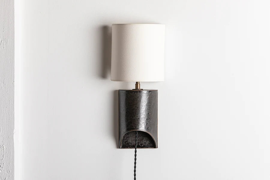
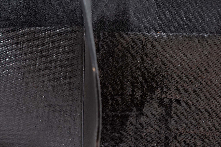
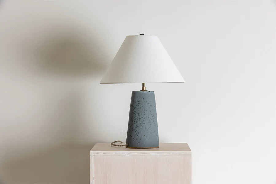
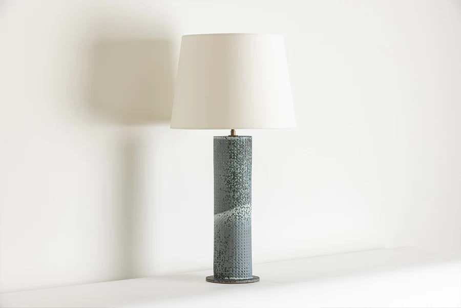
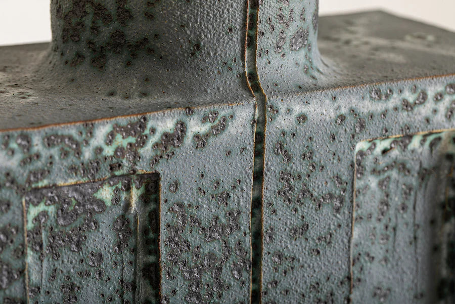
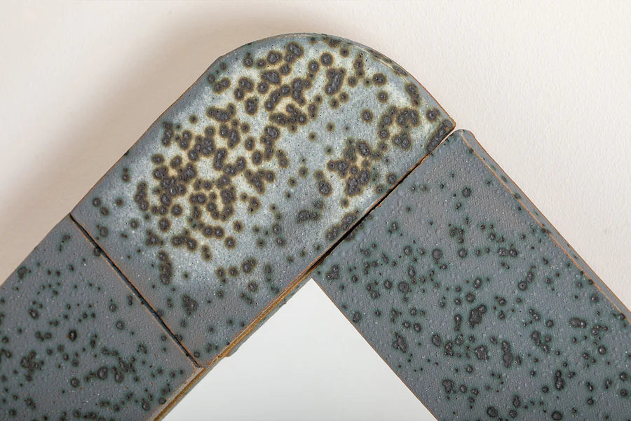
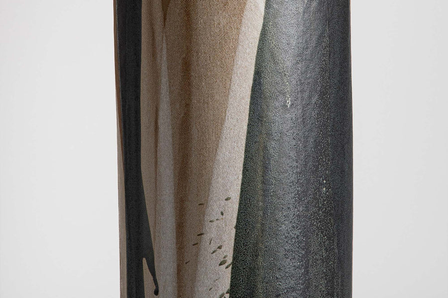
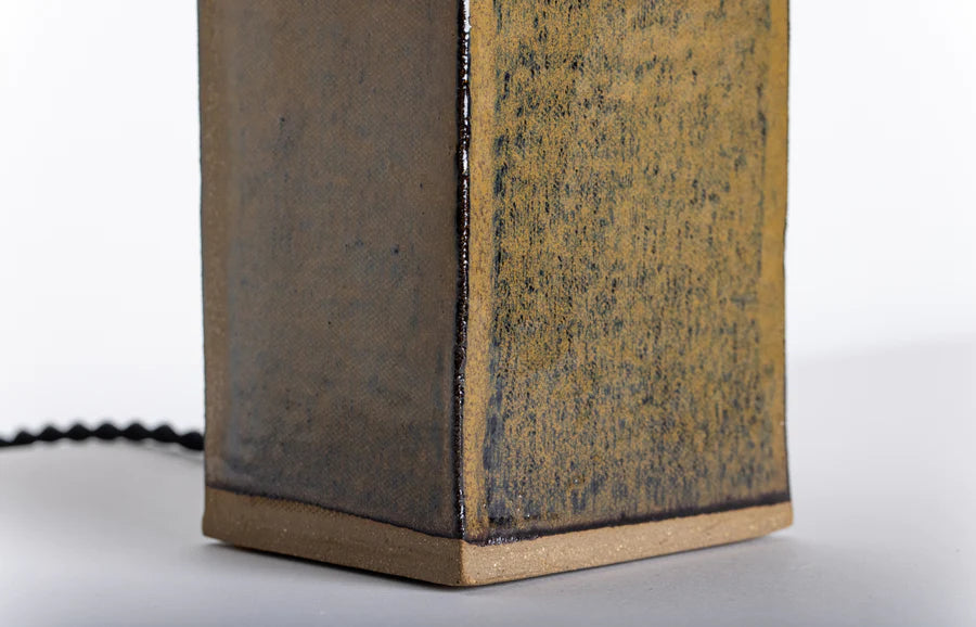
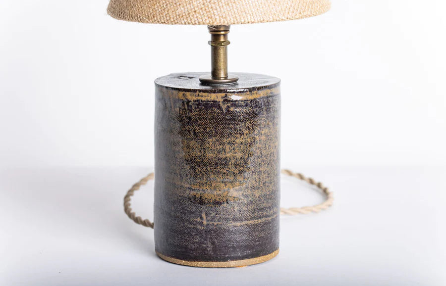
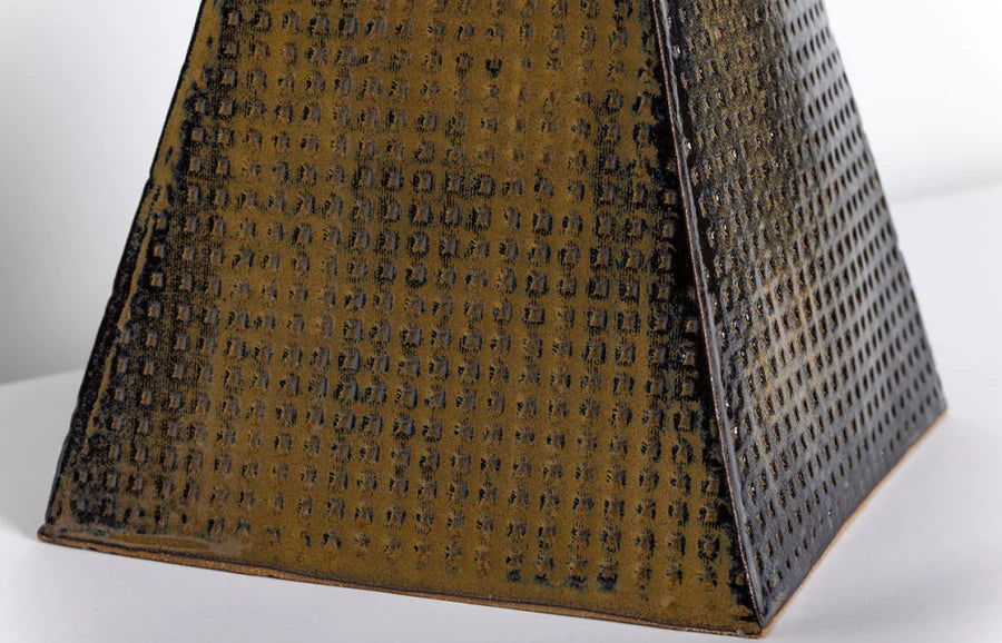
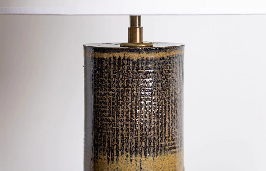
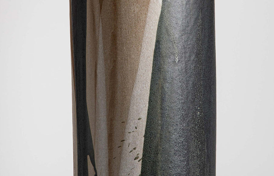
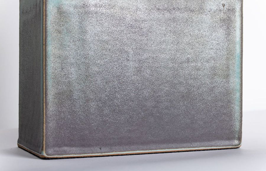
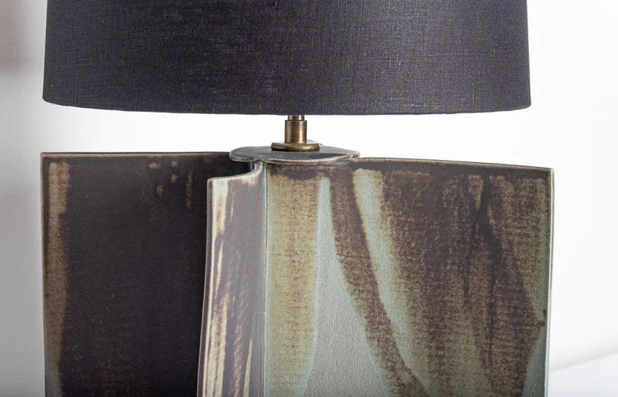
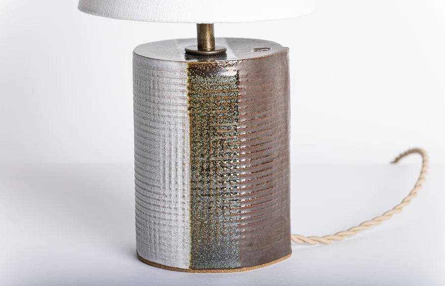
This glaze takes its name from the black-green hue that’s achieved when multiple layers are applied to the clay’s surface. With one or two layers, the glaze creates a more brown finish. Bottle Green’s high-polished sheen is suited to pieces with multiple intersections, edges and joints, which allow the glaze to pool and feather when fired.
Combinations
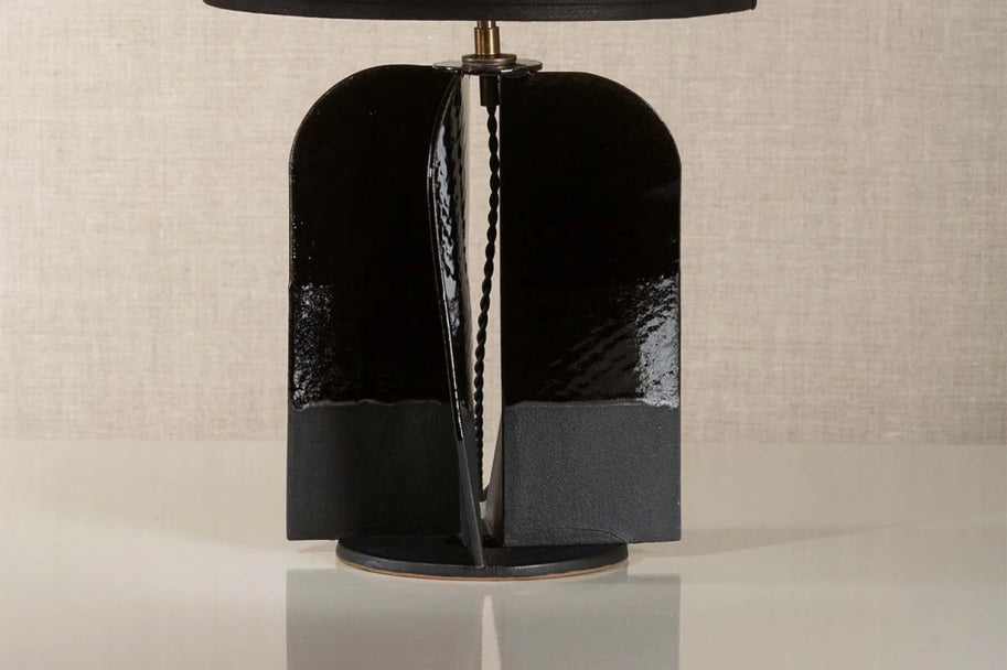
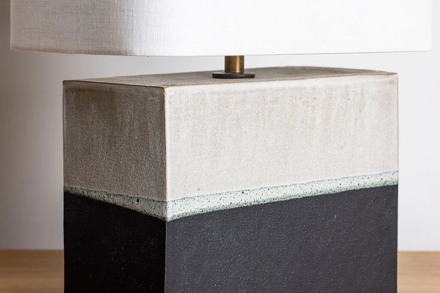
We often combine a thick layer of Bottle Green with Matte-Black, as seen here in the Hudson and Sag Harbor lamps.
Chalk
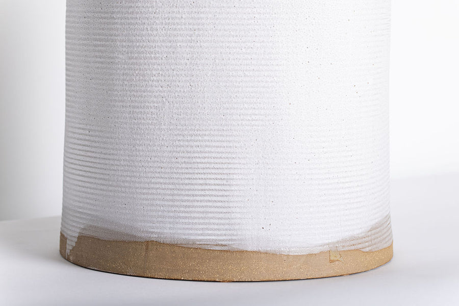
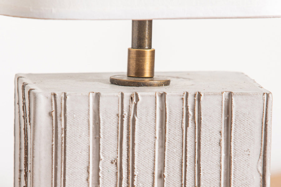
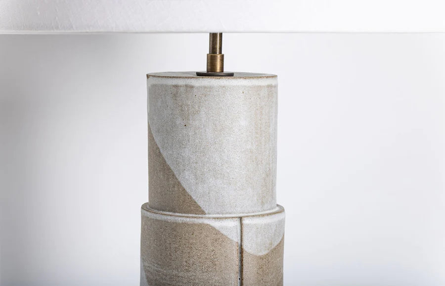
Chalk is a crisp, matte-white glaze that evokes the depth and texture of limewash. A go-to of ours, it captures the subtleties of our clay finishes incredibly well, as it is almost translucent in thinner applications. Further layers create a more opaque effect.
Combinations
The versatility of this glaze lends itself to a variety of combinations. We often use it as a clean contrast to our darker and more satin glazes, as seen on the Turnier vase.
It also plays well with others, when overlapped it creates an intensely glossy finish.
Hide
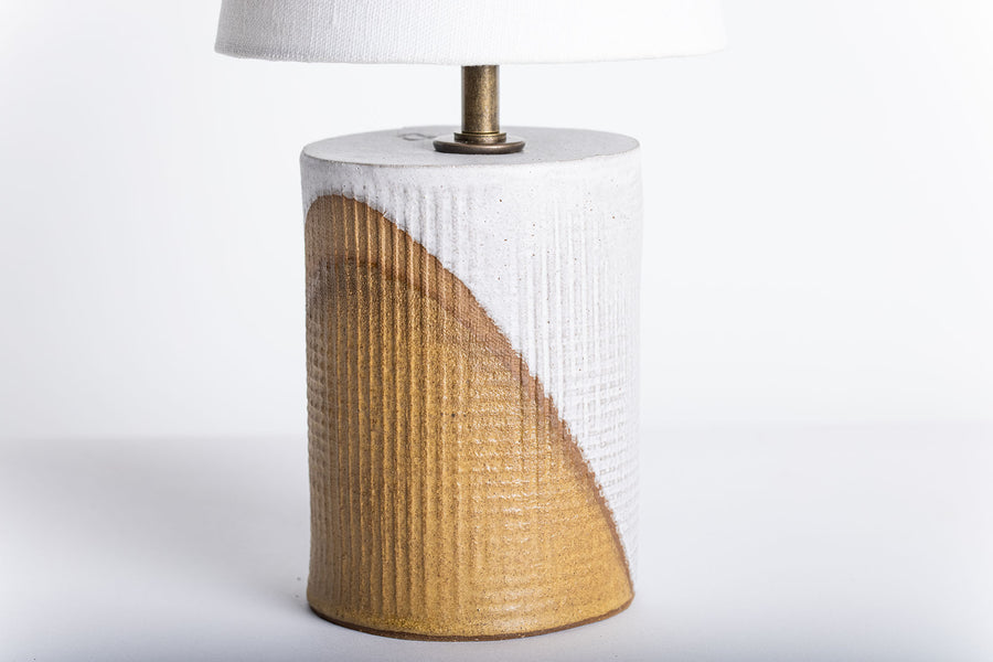
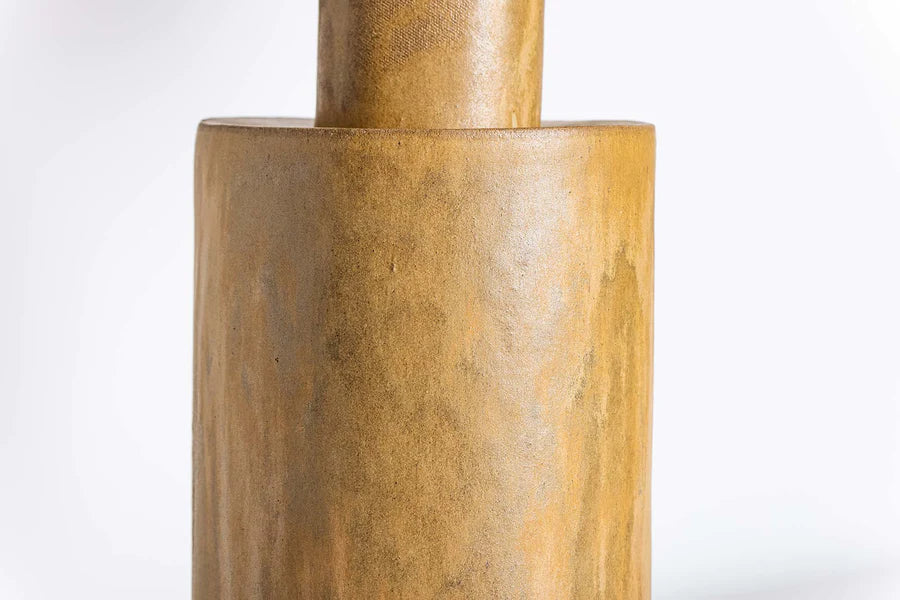
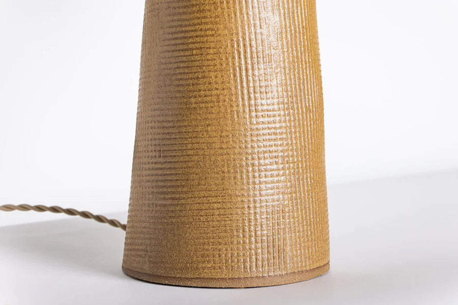
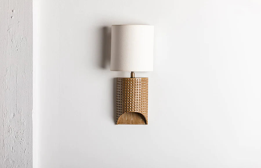
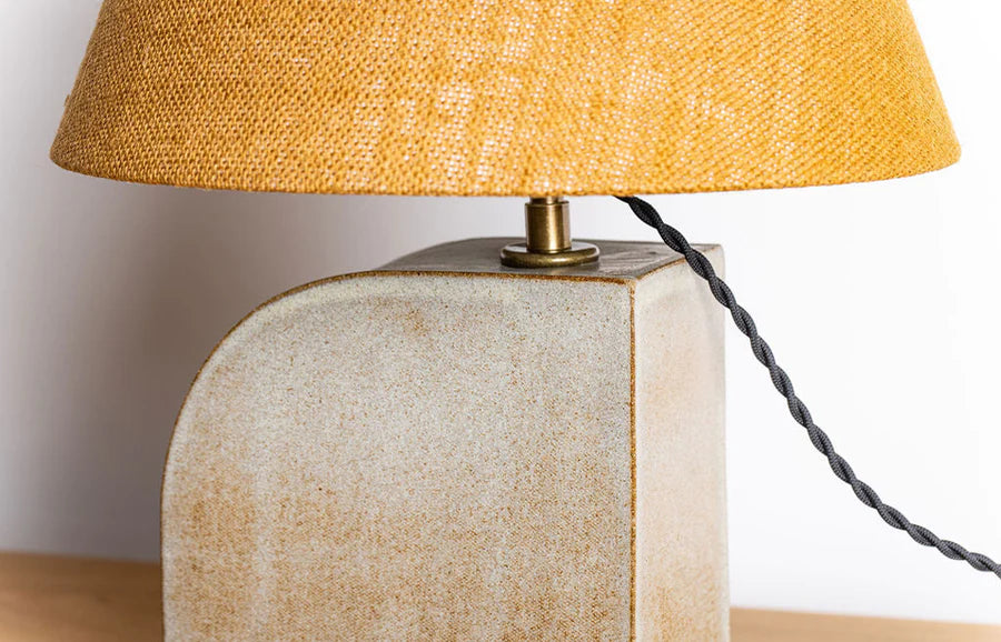
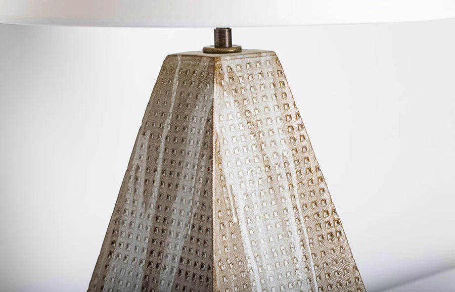
Hide is a nod to the leather-like finish that is created with thicker applications of the glaze. On textured surfaces and edges, this matte-satin glaze intensifies, burnishing its buff tone to a warm umber. It also contains a subtle fleck, which shimmers gently under direct light
Combinations
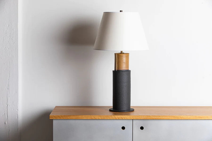
Like Chalk, this glaze lends itself to a variety of combinations. Hide’s matte warmth pairs perfectly with darker finishes (see our Madeline lamp and Turnier lamp above).
It also overlaps well, intensifying the other glaze, which can be seen on the small Thira lamp.
Lead
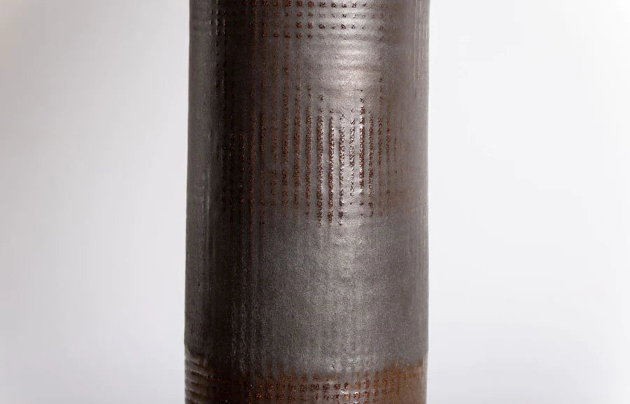
With its depth and sheen, this glaze often gets confused for cast metal. We like to use Lead on textured surfaces, as, when fired, it accentuates the clay’s surface through an interplay of matte and satin finishes.
Combinations
Lead’s graphite color is deceptive, especially when combined with other glazes. When paired with parchment, for instance, it creates a bottle green hue. With a thin overlap of Ochre, it becomes an intensely shiny aubergine.
It also works well with Matte-Black, creating a burnished overlap that contrasts Matte-Black’s pumice-like texture.
Lichen
Lichen, like its mutualistic namesake, is a fascinating composite. Interspersed in the glaze are flecks of copper that, when fired, oxidize to create grey-green mottling across the clay’s surface. Thinner applications of the glaze are more seafoam in color (they’re also more uniform), while thicker applications are more grey blue. The mottled pattern, like nature, is unpredictable, so we recommend this glaze is used in isolation on simple textures.
Matte-Black
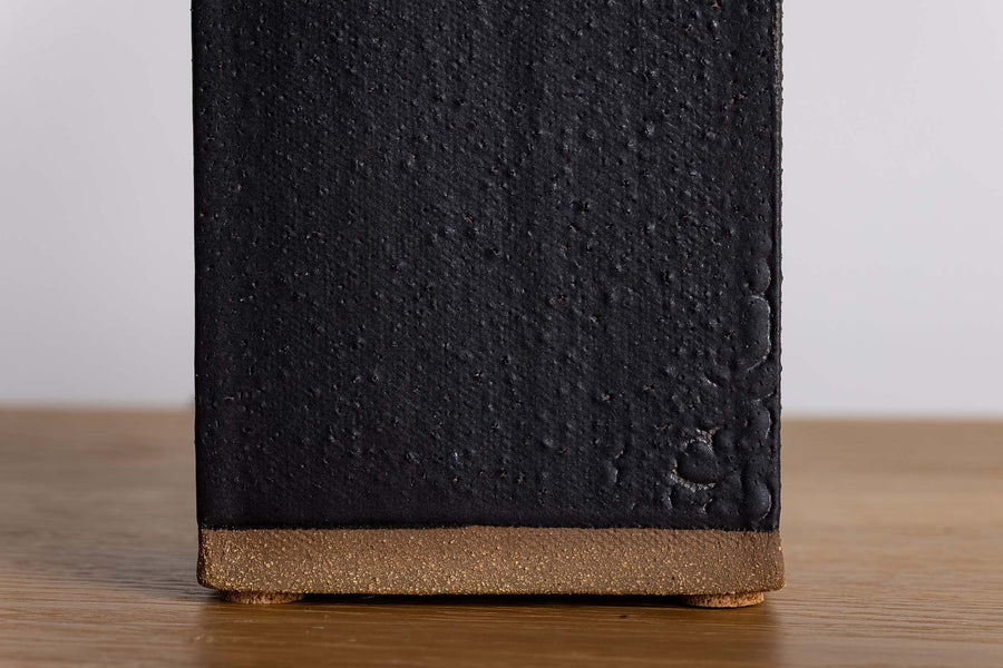
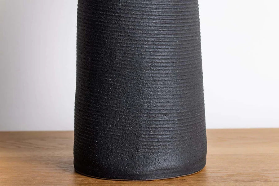
Our Matte-Black glaze has an earthen quality that intensifies the thicker that it is applied. In thinner applications, it possesses a satin-like finish that accentuates textures – even subtle ones. The more it’s layered, however, the more it becomes volcanic: matte, textured and intensely black.
Combinations
This glaze works best in contrast. In contrast to more lustrous finishes, as seen in the Mattituck and Sag Harbor lamp.
In contrast to lighter shades like in the dipped New Preston lamp and in the graphic compositions of the poured Hutton lamp. And even in contrast with itself, when both thick and thin applications are employed.
Mushroom
The mycological-like finish of this glaze is achieved through the overlap of our Lead and Ochre glazes and is an effect that can be varied. Thinner, more even overlaps result in a more lustrous finish but a more mottled coloration. While thicker overlaps create a rich golden color with red-brown undertones.
Ochre
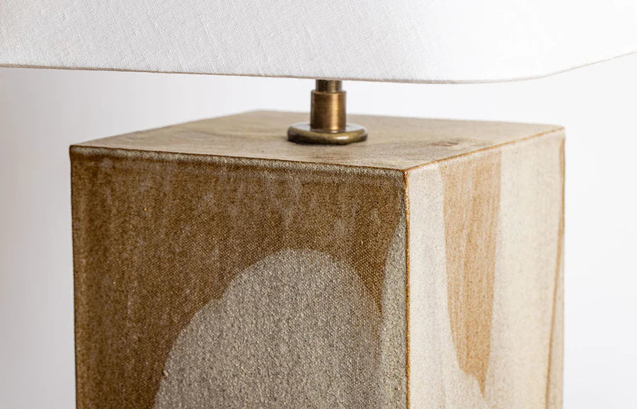
Ochre is one of our original glazes and an enduring favorite. Thinner applications reveal more of the clay’s character, giving the glaze a rich golden color and satin finish. However, when poured or dipped multiple times, Ochre becomes almost khaki in color, with a warm, metallic undertone.
Combinations
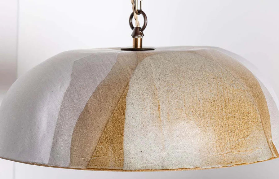
This glaze works well as a base for more neutral shades such as Chalk and Parchment, which can be seen on the poured Hirsch pendant and dipped Gowanus lamp. In both instances, Ochre gives these glazes a bit of warmth.
Parchment
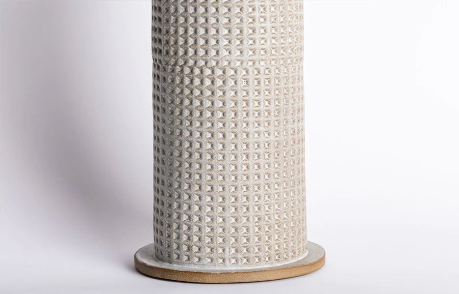
Parchment takes its name from the paper-like texture that is created when the glaze is poured or dipped multiple times. Rich and creamy, this warm white suits a variety of forms and finishes. It can also be used in thinner applications to accentuate textures, giving the piece a more satin-like finish.
Combinations
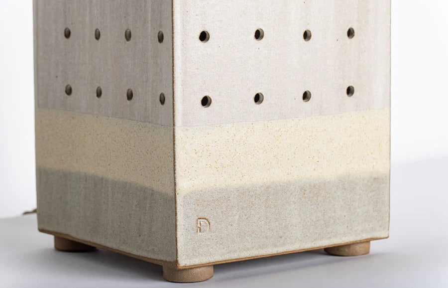
Like Chalk, Parchment lends itself to a variety of combinations. In combination with lighter glazes, such as Ochre, a matte and creamy finish is created, which can mottle and crack if Parchment is applied thickly.
In combination with darker glazes, like Matte-Black, it creates something entirely new: dark green. And in combination with itself, it creates a subtle sweeping gradation, especially when poured.
Sea
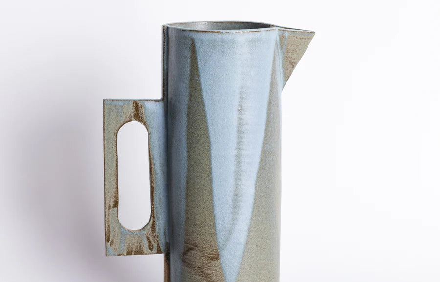
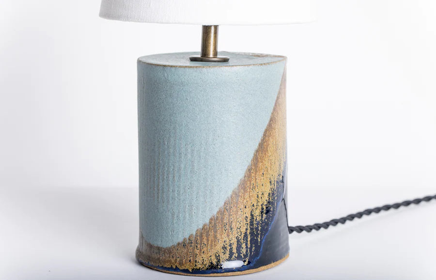
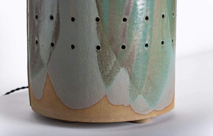
Sea is a new glaze for us. Incredibly matte, this glaze behaves like the sea, hence the name. In thicker applications, like on the Can lamp, it fires as a light blue, much like the water reflecting the sky’s azure. While in thinner applications, Sea possesses a green-ish brown tint, as seen on the Handle pitcher.
Combinations
Sea is a sensitive glaze, even its position in the kiln can influence the final color, so we’re experimenting with different pairings at the moment to determine what works best.
Currently, we’re captivated by the combination of Sea and Navy, which results in an intense ochre that feathers from matte to shine.
Verdigris
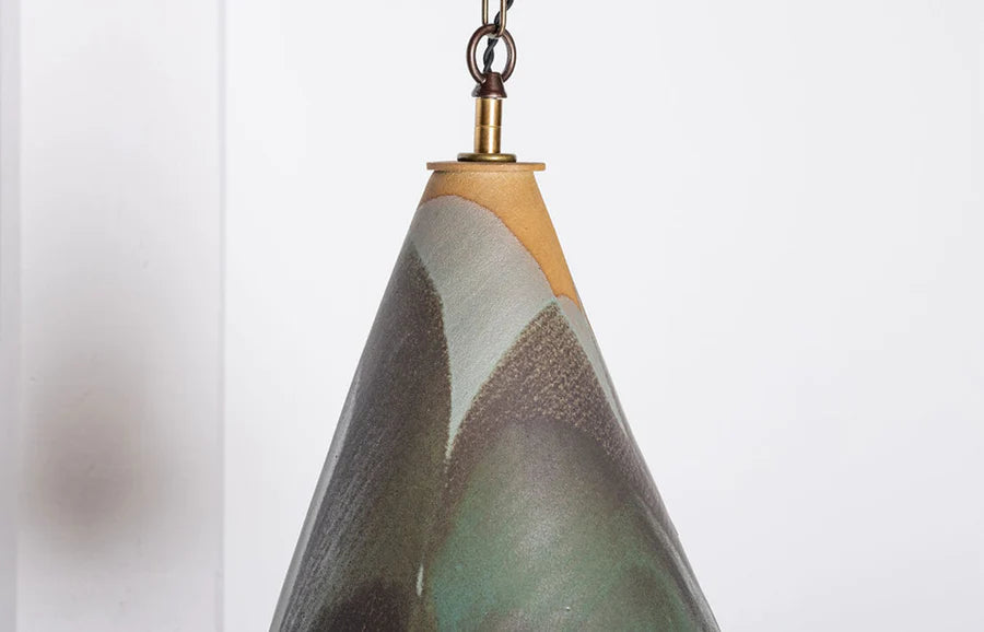
Verdigris takes its name from the vivid green pigment that is created when copper oxidizes. However, green is not the only color this glaze is capable of. A single layer of Verdigris gives you a coppery green. A few more layers and it becomes matte and grey. And, after a long heavy dip, it fires a vibrant teal. Due to this range, we tend to use it on its own, as seen on the poured Firefly lantern, which looks as if it has rivulets of oxidized copper streaming across its surface.
Walnut
Walnut is a rich, chestnut brown glaze that, when applied in thin layers, creates a subtle shine where the glaze breaks across the clay’s surface. Thicker applications of Walnut appear almost black and begin to obscure the piece’s texture.
Combinations
We combine Walnut with Chalk, which, due to the chemical reaction between the glazes, results in an array of greens, from deep and mossy to a watercolor-like celadon.
Walnut may also be combined with itself for an earthy, tonal palette, as seen on the Thira lamp.
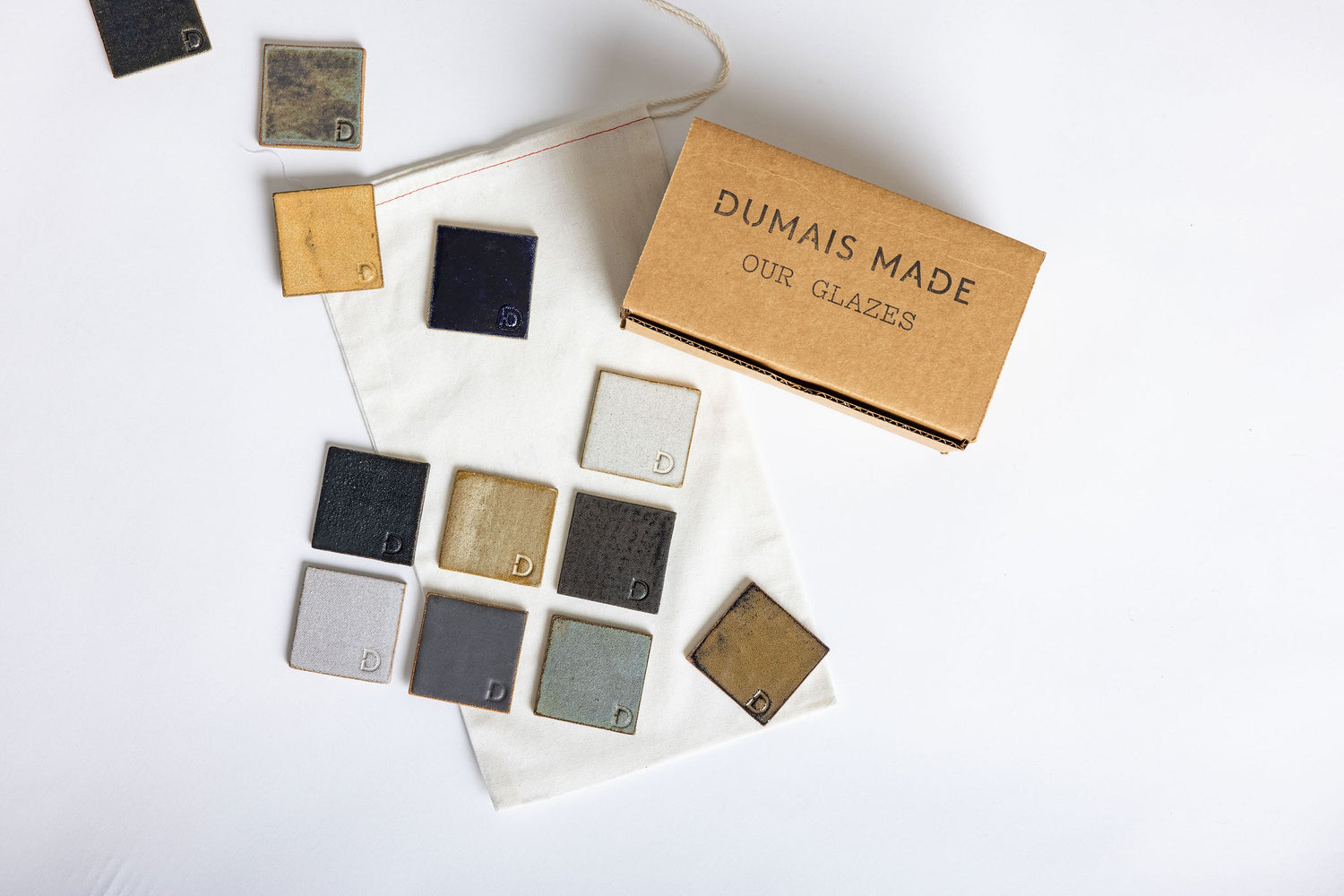
Everything's better IRL
Glazes are temperamental beings, and, while we try to capture them as best as possible, they're really best viewed in real life. Thankfully, we've put together a handy glazes kit for those who like holding things in their hand.

